

Evergreen Counseling
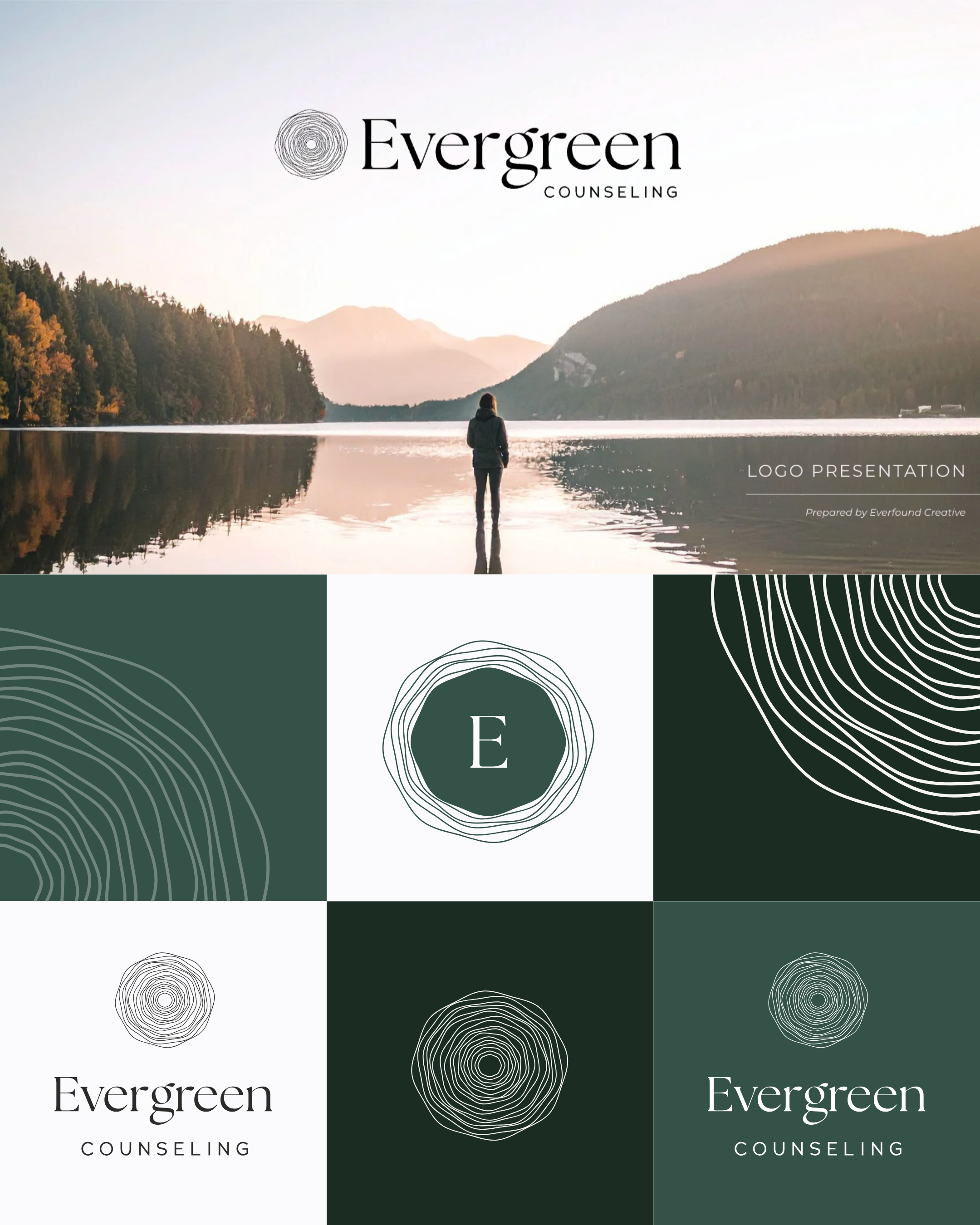
A Visual Identity Rooted in the Brand Story
Evergreen’s identity was designed around the idea of a quiet refuge—a place for growth, reflection, and support. The organic tree-ring mark, natural color palette, and refined typography create a brand that feels calm and restorative without relying on the typical visual language of a counseling practice.
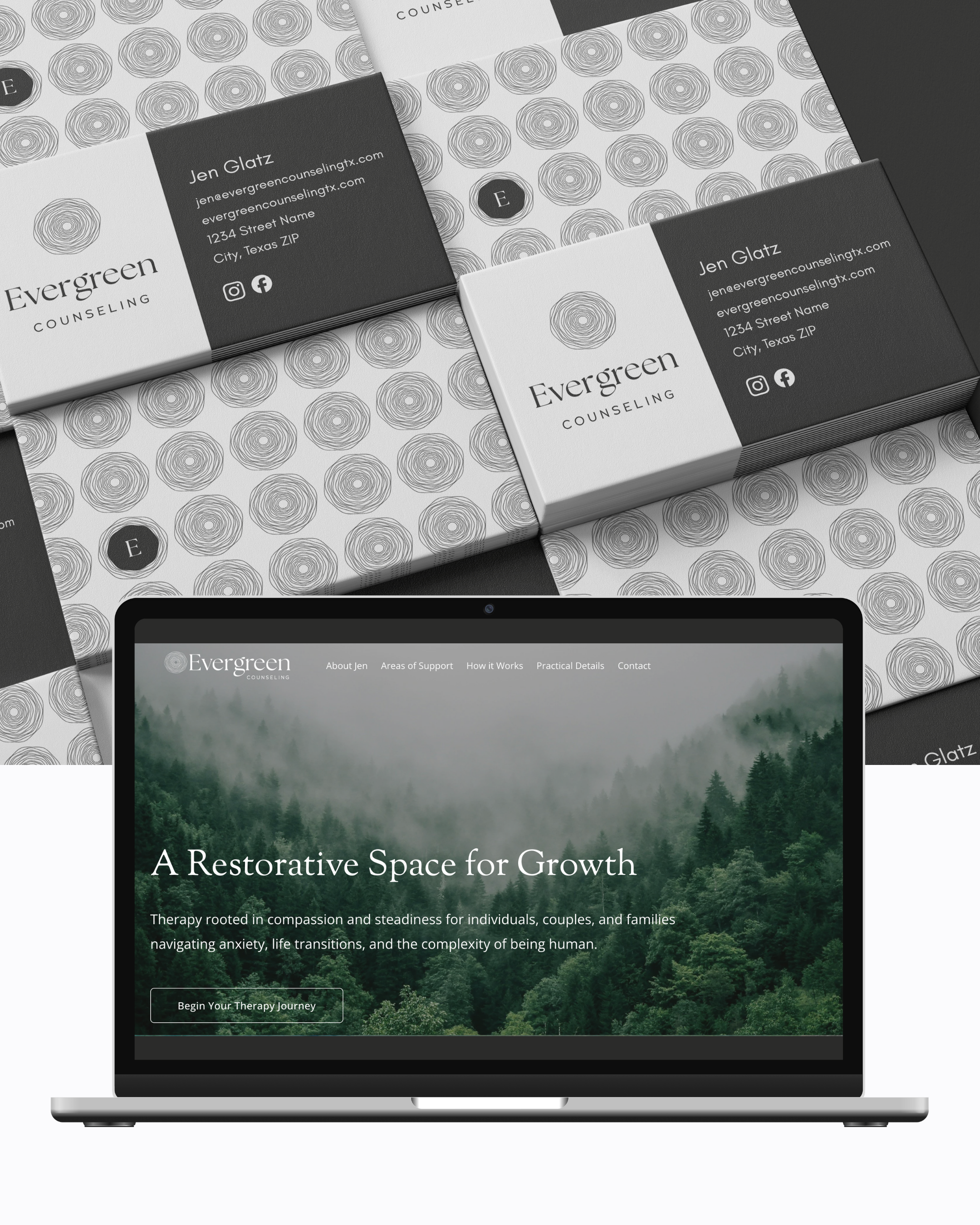
One Brand, Carried Through Every Touchpoint
A strong identity goes beyond the logo. Evergreen’s colors, typography, patterns, photography, and messaging were intentionally carried from print materials into the website, creating a recognizable experience wherever a client encounters the practice.
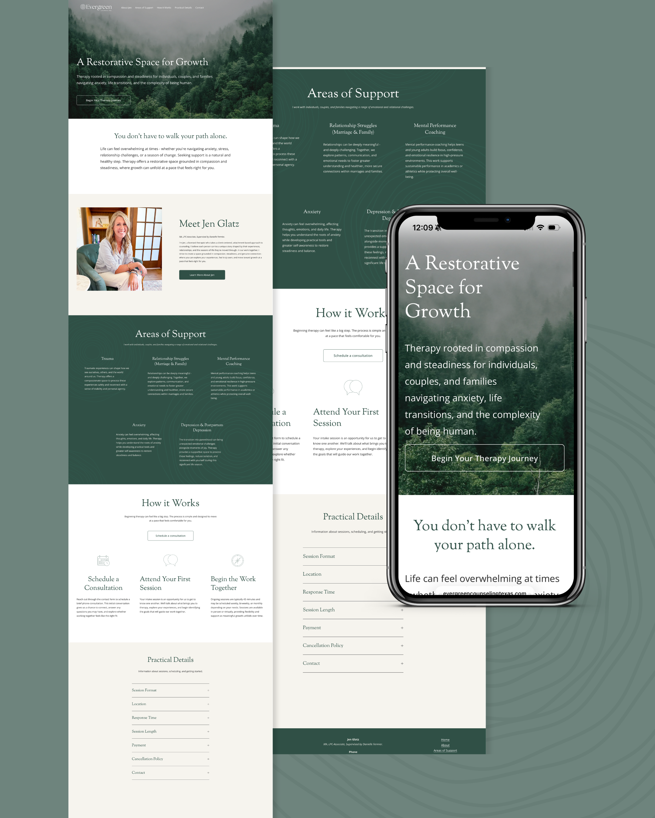
A Digital Experience Designed to Feel Calm
For someone searching for a therapist, the website experience matters. Clear navigation, thoughtful messaging, generous space, and a calming visual system make it easier to understand Evergreen’s services and take the next step without adding more overwhelm.